POP colors are those that are super bright and in-your-face. They’re the colors that make you do a double take, and they’re often pretty polarizing.
People either love them or hate them! If you’re someone who loves bold and unique color combinations, then this post is for you. We’ve rounded up different POP color schemes that are sure to turn heads.
Pairing complementary colors creates a look of high contrast that is sure to turn heads.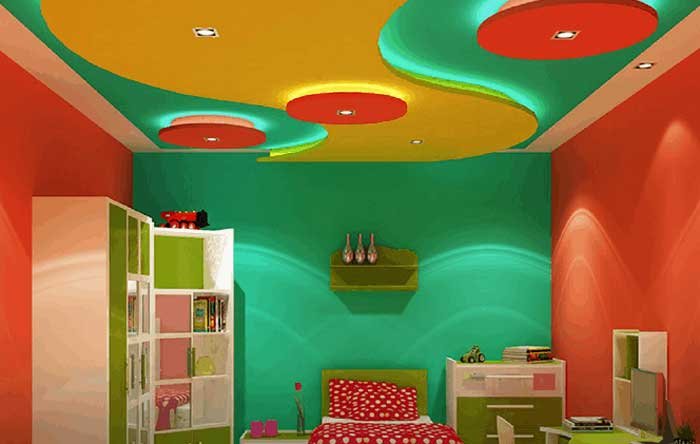
Colors that sit next to each on the color wheel are called analogous color combinations. These ways of pairing colors usually create a feeling of balance and peace.
To identify your three triadic hues, make a triangle on the color wheel. If you want to be a great artist or designer, it’s important to understand the universal perceptions and relationships of colors when it comes to pop design.
POP Color Combinations
1. Royal Blue & Peach
Beginning our list with a trendy color combination of royal blue and peach. People prefer this colour for pop design for hall. 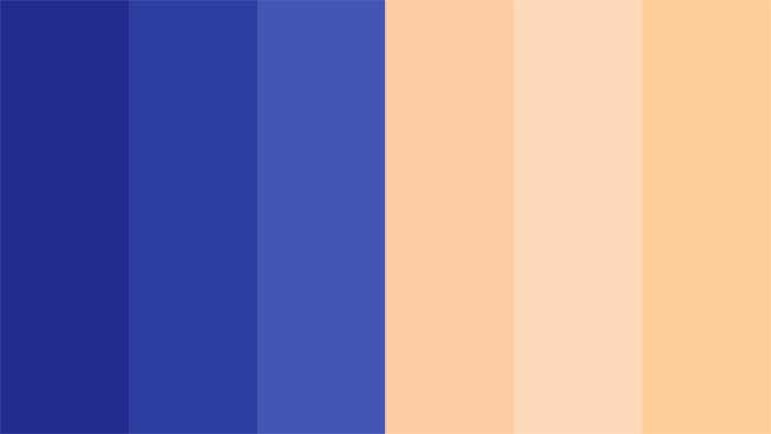 These colors form a triadic blend, where the royal blue produces a bold feeling while being balanced perfectly with the peach’s playfulness.
2. Blue & Pink POP Colour
Blue and pink are popular color combinations for bedrooms, especially for spring and summer. It’s also perfect for any event that could use a touch of whimsy.  You can even use it to decorate your home or office space. The combination of blue and pink is lovely.
Pink has a softer, spring-like pastel look, but blue has traces of maturity, giving the color palette duality.
3. Charcoal & Yellow Color
One of the most popular color combinations is charcoal and yellow (or black and yellow). 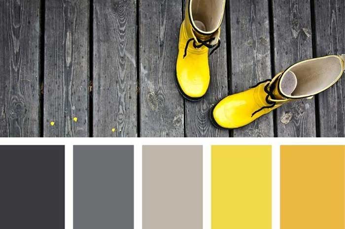 Due to their high contrast, these two hues complement each other quite nicely.
 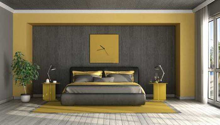 This combination would look excellent in a logo design or on a branded product label.
4. Red & Yellow Colour for POP
Red and yellow is a popular color combination, especially in the summertime. You can use this color scheme in your home decor to add a touch of brightness and cheerfulness. 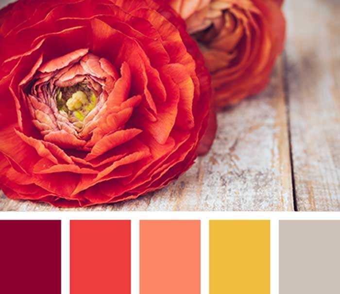 Try pairing red and yellow wallpaper together, or using red and yellow pillows on your couch. You could also paint one wall in each color, or use red and yellow floral arrangements around your home.
Try these colors for kitchen modern pop plus minus design to give it a royal look.
Adding pops of color is a great way to brighten up any space, and red and yellow is a cheerful combination that will do just that. Use this color scheme in your home decor to add a touch of brightness and happiness. Try pairing red and yellow wallpaper together, or using red and yellow pillows on your couch.
Also read: how to make purple colour here.
The bright and colorful combination of red and yellow is the next on the list. This complimentary color scheme is a representation of joy. Replace the hues from crimson to coral in this traditional red-and-white ketchup and mustard mix, and reimagine it with a modern, pastel twist.
6. Lavender & Teal POP Colour
Lavender and teal are popular color combinations that can be used in a variety of ways. You can use it to create a calming and serene atmosphere or to add a touch of glamour and sophistication. 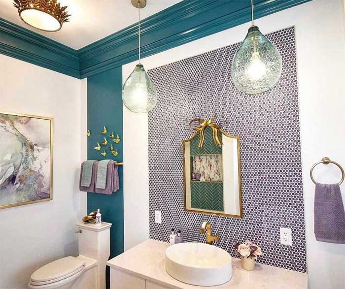 When using lavender and teal together, you’ll want to consider the overall tone you’re trying to achieve. People prefer this color for living room pop design for a uniuqe and moder look. For a more calming effect, stick with softer shades of each color.
Lavender and teal are the most popular color combination for all things aesthetically attractive. This mature yet fun combination is frequently utilized in baby items targeted at parents due to its earthy, harmonious vibe.
7. Cherry Red & Off-white POP Colour
This color combination is a little bit unconventional, but it’s definitely eye-catching! The bright cherry red is offset by the softer off-white, making for a fun and flirty look. 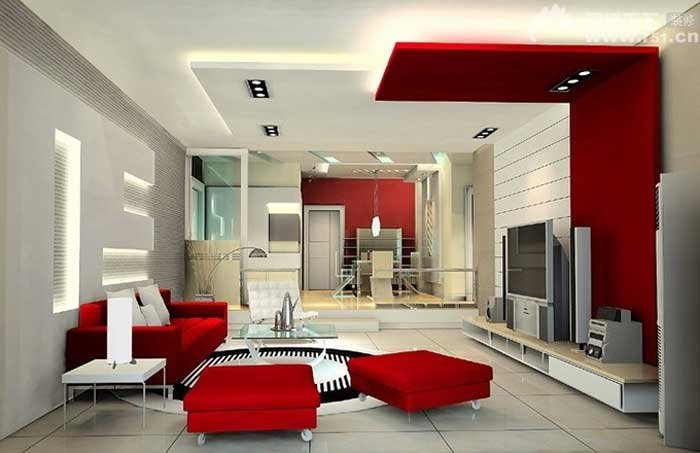 Pair the red with a white top and some nude shoes for a classic look, or go for something more daring with a printed top and red heels.
You can also try these POP colours for lobby plus minus pop design for gallery as well.
Cream or ivory walls make a soft and mild atmosphere. A classic color scheme is black, brown, dark green, light blue, and cream-colored walls with a darker hue than the main wall hue. Pure white rooms are powerful and tireless in their appeal.
8. Baby blue & white
This tranquil combination conveys trust and ease, evoking the sensation of looking up at the sky on a bright morning. 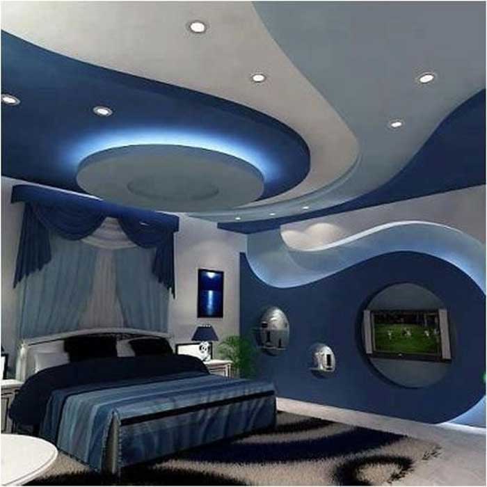 In the health, education, or nonprofit sectors, baby blue, and white are ideal brand color schemes.
9. Hot Pink & Cyan Color
The hot pink and cyan hue combination works well in this example. It’s a variation on the traditional baby pink and baby blue. 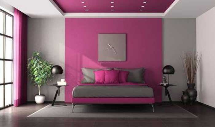 These bright, high-contrast colors evoke an eagerness that is perfect for a more fun brand. Make your bedroom a modern one with these color combination for bedroom pop design for simple or plus-minus design.
10. Peach & burnt orange
Use peach as your base color and add accents of burnt orange to give your room a pop of color. 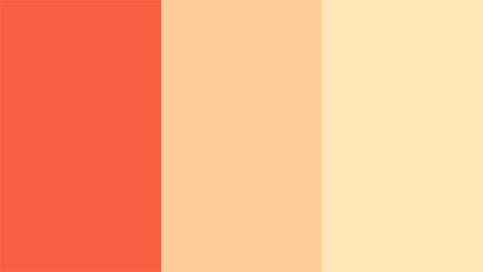 This combination is great for living rooms, bedrooms, and kitchens. The color scheme is comparable to that of peaches and burnt oranges.
This can be a perfect colour for pop plus minus design for porch.
11. Light Blue & Dark Blue Colour
The light blue and dark blue hues may not be appealing to some, yet the combination isn’t to be overlooked. 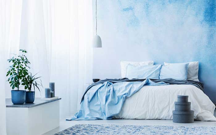 The monochromatic hue exudes professionalism and trust — making it ideal for insurance firms or banks.
Also read wall colour combination for living room.
12. Sky Blue & Bubblegum Pink
Up next is a timeless classic: sky blue and bubblegum pink.  The playful bubblegum pink complements the cooling baby blue perfectly, making this color pairing ideal for brands related to parenting, childcare logos, children’s fashion, products, or toys.
Consider reading: How to make pink colour
13. Mustard, Sage, & Forest Green
In comparison, the robust and natural mustard, sage, and forest green are rugged and natural. 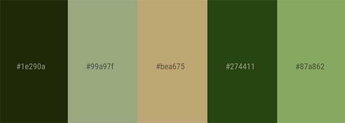 The perfect earth-tone color scheme is formed by these hues. These colors go well with organic products and make great logo designs for businesses. Radium paint is also a good option if opted with this colour combination for POP.
14. Fuchsia & neon green
Looking for a vibrant and daring color combination? Try pairing fuchsia with neon green. 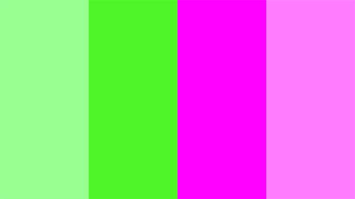 This combo is sure to create an energetic atmosphere, making it perfect for fashion or avant-garde design.
Check the asian paints colour combination with code for more details and new pop color combination
Conclusion
There are an infinite number of ways to mix and match colors, so don’t be afraid to experiment. With a little bit of creativity, you can come up with a color scheme that’s perfect for your brand.

Lavender and teal POP Colour looks so complementing.