Wall art is more than just a decoration; it does not only stimulate our senses but can also evoke different emotions, which can all relate.
A key choice that is frequently made whilst choosing the right piece of wall art is to choose a proper collection of colors.
The colors in which we live around ourselves go as deep as our souls and can inexpressibly influence our mood, energy, and the wholeness of our welfare in a way that is very powerful.
So, the question arises: What color do you prefer us to use in wall art? Get ready to explore the psychology of colors and see how different shades each can affect your interior and mood.
Understanding Color Psychology
While you’re probably excited to start choosing wall art colors, a thorough understanding of the color psychology is crucial before you start.
Color can recruit a number of feelings as well as bring in associations that direct our thoughts and behaviors, while at the same time these abilities are so subtle that they seem to be quite natural.
Here’s a brief overview of some common colors and their psychological effects: Here’s a brief overview of some common colors and their psychological effects:
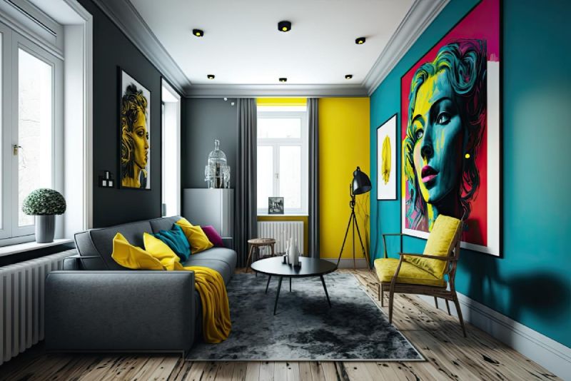
- Blue: Peacefulness, calmness, and quietness are all synonyms of blue, and it is mainly used to make this feeling of tranquility using the combination of colors. It has an ability to trigger such wonderful emotions as harmony and tranquility, so it is absolutely suitable for bedrooms, living rooms and any places in the house where calm and quiet are mandatory.
- Yellow: The source of sunshine and smiles, yellow emits the positive energy that is highly relaxing and supporting. It can bring out senses of happiness, comfort, and satisfaction, and be an excellent choice for kitchens, dining areas, or home offices, where imagination and productivity are wanted.
- Green: Nature, growth, and renewal – these are the associations that come to mind when we think of green. Green represents growth and the coming of spring, thus it’s so refreshing and uplifting. It has the power to bring on a sense of balance and harmony, making it the best option for a room designed for relaxation like a bedroom, yoga studio or reading nook.
- Red: Bright, excited, and strong, these are all possible descriptions of a color like red which is a very powerful color and it can be able to stimulate the sensors of the different senses and evoke strong emotions. The contrast of these colors often brings up rejuvenation, enthusiasm and generally impacts the space with vitality thus making it a good choice for accent walls or focal points in living spaces.
- Purple: It must be noted that purple is a combination colour of blue (calming) and red (energy), thus being luxurious, creative, and spiritual as well. It may create a kind of esoteric appeal that is integral for simply dignifying the display of two or more art pieces simultaneously or for simply adding longevity to a communicative space.
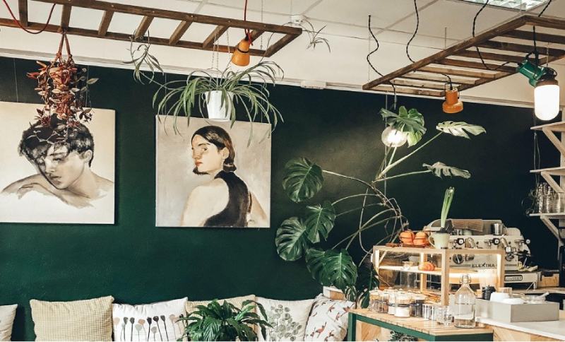
- Neutral Tones: Plain colors like white, beige, and gray, can be used for that very reason that they are versatile and have a quality of being timeless. They can be the neutral element in a room, or seen as something that shows a perfect simplicity of design on their own.
Have a look at mandir design in wall.
Personal Preferences in Wall Art Colors
There are various wall art colors that you may prefer, but it’s a personal decision that has a big impact on the selection.
Do yourself a favor and pick out your favourite color, subculture, and individual experience to help you define your vision of an ideal space.
Here are a few factors to consider when determining your preferred color palette for wall art:
- Emotional Response: Think about the way different colors embarrass or soothe you. Is there a tendency in you to go to relaxing colours, like blue and green, or do you favour bright and intensely coloured like red and orange? Think about if the space should portray certain feelings to you and its guests. Pick the colors you want to use.
- Room Functionality: Visualize what the wall is going to be used for – where the feature will take place. In the same way, an example can be provided wherein the bedroom has only soft and soothing colors to give a feeling of relaxation. Instead of a home office or studio, gray colors would be a good choice. The energizing hues like yellow or orange would be equally good.
- Existing Decor: Consider the existent color pattern that you have and decoration features in your room when you are coming up with a paint color that you want to use. In the same way, decide on the colors of wall arts that match with the ones that you have on the wall, furniture, and accessories and have a well-coordinated and visually appealing look.
- Personal Style: Look for the clothes that fit your personal style and taste because they help to improve your look. By ancient mindfulness and modern cognitive behavioral therapies and ancient brilliance and modern incisiveness I found my strategic self-interest and derived the full pleasure of life. Consider your wall art that will go well with the room’s theme and your personality.
Read about – Two colour combination for bedroom walls
Finding Your Perfect Palette
Therefore, for an illustration, a universal response on a color of wall art would not be found. The harmonious color scheme you are going to use will be influenced by a number of pull factors, for example, the emotional effects of colors, the functionality of the room, and your style specifics.
Here are a few tips to help you find your perfect wall art colors: Here are a few tips to help you find your perfect wall art colors:
- Experiment: But never forget, give yourself permission to be different – explore all kinds of colors, patterns and styles. Hang up positions or samples of your colors you like the most at the light to see how they look in your space before painting a particular wall next.
- Consider the Mood: Keep in mind the structure of an elegant and pleasant atmosphere in a given space. Whether you are trying to achieve a serene place for meditation, stimulate the performance in your working space, or a comfy spot for relaxation, consider color choice of artwork to match the desired mood.
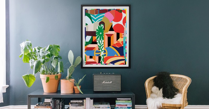
- Mix and Match: By no means should you be limited to singular colors. Instead, experiment and play with different shades and textures to introduce depth and visual stimulation to your walls. The option is to make use of an addition of complementary or analogous colors to create a consistently balanced look.
- Personalize: One in all, Choose an interior design that portrays your persona and taste. Connect with something that will really make you smile in your room. It can be a vibrant abstract painting, a peaceful landscape photograph, or even a diverse collection of different artworks. Choose wisely, according to your own taste.
You can also look at bedroom wall painting.
Conclusion
Finally, good artists are the ones who are able to create art from the simplest of things.
Through the knowledge of color therapy psychology basics and a concern of such issues as emotional reaction, room function, examining the already existing style and your personal preferences, you will be able to find an ideal palette that matches your inner self and upgrades your space beauty and mood.
You, therefore, need to be patient, try things out and use your walls as your personal canvas. Personalization should be your goal and your home should act as an extension of you.
Consider reading -
