The colour palette for your walls is one of the most crucial choices you’ll make in regard to decorating an office space. Both the general beauty of your environment and the attitude and performance of your staff may be greatly influenced by the colours you pick.
Office Wall Colour Schemes
We’ll look at some of the greatest office wall colour schemes in this article to assist you in designing a workplace that is both practical and aesthetically pleasing.
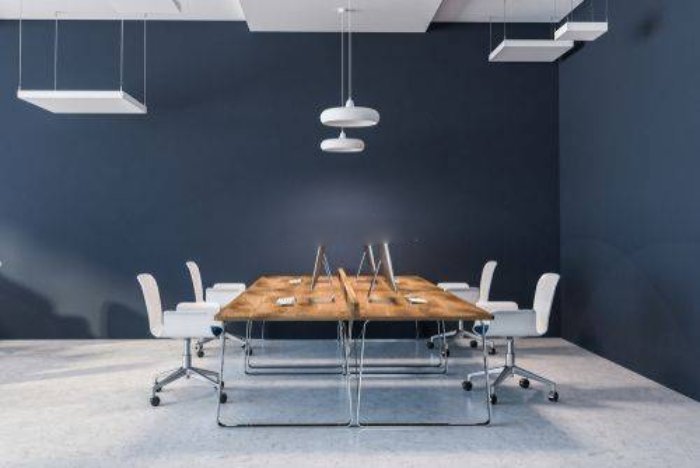
Blue and White: The traditional colour scheme of blue and white is the best wall colour combination for workplace interiors. White gives a clear and bright background, whereas blue is considered to encourage productivity and attention. Both classic and contemporary office environments can benefit from this colour combination.
Green and Brown: When designing an office space to evoke a feeling of serenity and relaxation, green and brown combination are an obvious choice. Brown has a grounding influence, whereas green is linked to nature and development. This combination functions well in workplaces with a more laid-back and creative environment, such design studios or marketing companies.
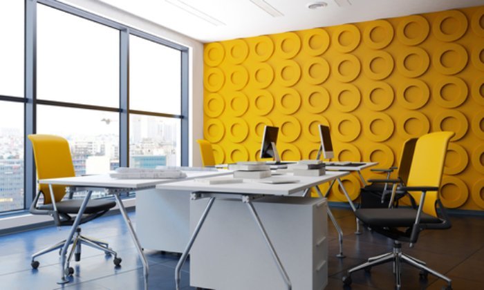
Grey and yellow: Grey is a well-liked neutral hue for offices, and combining it with yellow makes the area feel cheery and lively. Yellow is a fantastic wall colour for a workstation since it is linked to optimism and cheerfulness. This combination works well in settings where a positive, upbeat vibe is desired, such as workplaces.
Grey and purple: Purple is a dramatic and strong hue that may bring a touch of refinement to any professional setting. It gives off an appearance of modernity and elegance when combined with grey. This wall colour combination with perfect wall cladding options works effectively in businesses like advertising agencies or graphic design studios that wish to project an air of creativity and innovation.
Red and White: Red is a strong hue that may arouse sentiments of passion and enthusiasm. It produces a strong and startling appearance when used with white. This wall colour combination works effectively in businesses like sales teams or startups that seek to project a sense of vitality and urgency.
Orange and grey: Orange is a happy, vivacious hue that can inject a little fun into any business setting. It produces a contemporary and energetic mood when combined with grey. In offices that wish to project an air of inventiveness and invention, like software companies or advertising agencies, this mix works well.
Here you should know about these best office decoration tips.
When picking office wall colours, there are a few important things to bear in mind in addition to these colour combinations.
- First, think about how much natural light your location gets. A room might feel smaller and more claustrophobic by using darker colours, or a room can feel larger and more open by using brighter colours.
- Consider the kind of work that will be done in the area second. If you do a lot of creative work, you might want to use colours that are more vibrant and energising. If your workplace is more traditional, you might choose to go with more subdued hues that exude stability and professionalism.
- Finally, keep in mind that choosing a hue is rather subjective. It’s crucial to pick a colour scheme that captures your company’s identity, culture, and core principles. You can design an office environment that is both useful and aesthetically pleasing with the correct colour scheme, motivating your staff to produce their best work.
Here are some attractive and comfortable furniture for the office. Which will give a pefect office look to your business. Also match the office chair design with the furniture.
Colour psychology’s influence on office design
Colours are a potent tool in workplace design because they may inspire a range of feelings and moods.
People react psychologically to different colours in different ways, and these reactions might change depending on past experiences and cultural background.
These are some common office wall colours and some psychological impacts that go along with them:
Blue is a common hue for workplace walls because it represents stability, productivity, and serenity. It’s the perfect hue for occupations that need concentration, like programming or accountancy. Yet, it’s crucial to avoid using too much blue since it might produce a chilly, uninviting atmosphere.
Green is a relaxing hue that symbolises peace, development, and balance. Particularly in industries that call for creativity or invention, it’s fantastic for fostering a peaceful and productive environment at work.
Yellow – A happy hue, yellow may inspire creativity and mental activity. It works well in creative fields like advertising and graphic design. Yet, it’s crucial to pick a subdued yellow to prevent overpowering workers.
Red – Red is a strong hue that can raise blood pressure and heart rate, making it ideal for occupations requiring physical activity, like sports or fitness. But, it’s crucial to avoid using too much red because it might make the setting tense.
Making the Best Lighting Decisions for Your Workplace
Another crucial aspect to take into account when creating an office is lighting. The appropriate lighting may improve productivity, decrease eye strain, and foster a pleasant working atmosphere.
The following advice will help you select the ideal lighting for your workspace:
Natural Light – As it offers a number of advantages to workers, including lowering eye strain and boosting vitamin D synthesis, natural light is the ideal source of illumination for a workplace. Desks should ideally be placed near windows to maximise natural light.
Task Lighting – Task lighting is created to offer concentrated illumination for particular tasks, like reading or writing. It’s crucial to select task lighting, that can be adjusted so that workers may set the light source to suit their needs.
Ambient Lighting: Ambient lighting gives a room overall illumination and can produce a cosy, welcoming feel. Ambient lighting with office wall colour should not be excessively bright or too dark since this might have a detrimental effect on productivity .
Energy-Efficient Lighting – Energy-efficient lighting benefits the environment and lowers monthly power costs. Office settings frequently use LED lighting with wall colour since it lasts a long time and uses less energy than conventional bulbs.
You should also know about these office glass films which is mostly used for it.
In conclusion, lighting and colour are essential components of workplace office design that have a big influence on how a room feels. It’s crucial to take into account the psychological impacts of colours when creating a workplace and select lighting that is both practical and pleasant for staff members. You may improve employee happiness and increase productivity by setting up a cosy and effective office.
Frequently Asked Questions
Q.1 What is the best variety of color mixes for the advanced office?
Answer – Present-day workplaces can profit from an assortment of various plans. Well-known decisions include:
- Grays and blues are known to advance a quiet and central air. Dark conveys complexity, while blue is frequently connected with effectiveness.
- White and green: This differentiation makes a characteristic and invigorating climate that lessens pressure and increments efficiency. White is spotless and contemporary, while green is frequently connected with resourcefulness.
- Current workplaces can profit from the smooth, modern look that high contrast makes. White goes about as a perfect, cleaned-up foundation, while dark adds aspect and difference.
- Grays and yellows make a blissful, splendid climate and increment representative joy. Dark gives a nonpartisan, quieting balance, while yellow is generally connected with satisfaction and inspiration.
- Pastel: Delicate pastel tones, for example, pinks, blues, and greens cause the work area to feel comfortable and loose. These shades are ideal for the cutting-edge working environment as they can advance a feeling of equilibrium and harmony.
The ideal variety plan for the work environment eventually relies upon the organization’s singular prerequisites and objectives. Varieties ought to mirror the organization’s character and advance a positive workplace for representatives.
Q.2 How does office wall variety influence worker efficiency?
Answer – Representative efficiency can be extraordinarily influenced by the wall color of your work area. Here are a few different ways shade can influence your work environment.
- Variety can gigantically affect individuals’ perspectives and feelings. Cool tones, for example, blues, greens, and purples are quieting and unwinding, while warm varieties, for example, reds, oranges, and yellows are empowering and energizing. An ideal variety plan can cultivate a climate that encourages advancement and effectiveness.
- Endlessly center: A few shades can befuddle, while others can further develop concentration and focus. Splendid shades, for example, red and orange can be excessively animating and diverting, while quieted blues and greens can assist you with keeping on track.
- Imagination and Development: Specific shades are related to these two attributes. For instance, yellow is frequently connected with advancement and crisp reasoning. Utilize this shade at work to support your imagination and create new thoughts.
- Some unacceptable mixes of tints can cause eye strain and weakness, which can adversely influence your result. Conceals that are too light or too dull tire the eyes, while a variety of conflicts are outwardly tiring.
In general, work environment wall tone can altogether affect representative efficiency. Bosses can make a useful and compelling working environment by utilizing a variety of conspires that advance great stance, concentration, inventiveness, and lessen eye strain.
Q.3 Are there sure varieties to stay away from while painting office walls?
Answer – While there’s no particular shade you ought to stay away from totally while painting the walls of your working environment, there are a few varieties that simply don’t great search in specific circumstances.
- Red: Regardless of being a brilliant and energetic shade, red can likewise be overpowering and distracting. In general, it isn’t suggested for use in regions that require consideration and concentration.
- Splendid, distinctive varieties can cause eye strain and visual weakness, which can adversely influence your efficiency. We suggest utilizing these shades sparingly as a line of improvement.
- Excessively dull Colors: Colors that are too dull give the feeling that the room is little and shut. It can likewise impede light, which can make the room look dim and dull. As pronunciations or in little regions, it is prescribed to utilize dull shades once in a while.
- A variety of conflicts can be truly burdening and diverting. While picking variety mixes, try not to contend with colors and consider how varieties complete one another.
By and large, taking into account your association’s extraordinary necessities and objectives is vital to picking the best shade for your work environment, the utilization of clever varieties can make a productive and compelling work environment.
Q.4 What elements ought to be thought about while picking office wall paint and how could the brand personality of the organization be reflected in the various decisions?
Answer – There are a few interesting points while picking a wall tone for your working environment, including your organization’s image personality, kind of workplace, and representative inclinations.
While picking a work environment wall variety that addresses your organization’s image, you ought to think about the accompanying variables:
- Brand Character: The varieties picked for the workplace walls are intended to convey the brand’s personality. For instance, an innovation organization could pick contemporary, proclamation tones to address development and development, while a well-being and health organization could pick quiet, normal tones to underscore prosperity.
- An organization logo can act as an inspiration for picking a wall to conceal for your work environment. The workplace can uphold the ID of the organization’s image by utilizing colors that are comparative or correlative to the shades of the logo.
- Consider the socioeconomics your organization needs to reach. To engage a more seasoned segment, monetary organizations might pick customary and moderate tones, while promoting firms might pick brilliant and striking shades.
- Industry: Office variety norms can differ by industry. For instance, a law office might pick conventional expert tones to address incredible skill, while an innovative organization might pick strong and particular shades to energize inventiveness and development.
- Lit: Lighting can change the tone of a room. For tones to show as expected, it is essential to consider the regular and counterfeit lighting conditions in your office while picking conceals.
